An effective breakpoint strategy helps deliver sharp, properly sized images, which are some of the most compelling pieces of content on a web page. In this blog, we will explore some important factors to consider in image breakpoint decisions to deliver the optimally-sized web image every time.
Start with Image Optimization Best Practices for Device Breakpoints - Part 1
The following are 4 tips for getting image breakpoints right:
1. Know the Screen Resolution Market Share
The first factor to consider is screen resolution market share. Statcounter is a great resource to obtain this information. For example, here are the screen resolution market shares for mobile, desktop and tablet devices on a global level:
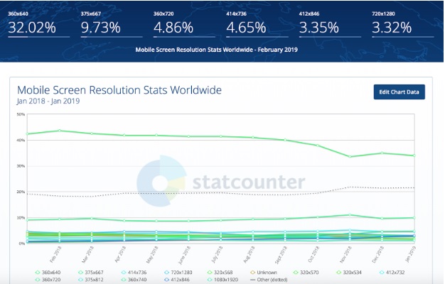
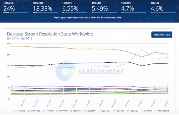
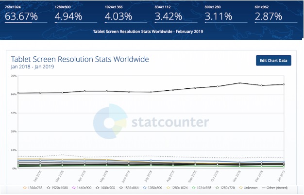
Evaluating all three types of devices is necessary to create a comprehensive breakpoint strategy, as they each have a unique screen resolution market share. None of us want to spend development or design cycles on the least important screen resolutions. Knowing market share can help you focus efforts on the most popular and critical ones.
2. Know Your User Base's Screen Resolution Breakdown
While an overview of the global screen resolution market share is key, it is important that developers not rely only on general data. It is also important for developers and designers to be able to see the breakdown in screen resolutions across their own user base.
An individual organization's resolution size distribution may be quite different than the market breakdown due to factors such as specific technical requirements, targeted user groups or other demographics, and RUM data is critical to gathering this information.
Focusing on real user monitoring (RUM) and data can help developers automatically capture screen resolutions and filter on other dimensions such as browser, device, location, and connection type. This allows developers to hone in on their own specific use cases, and prioritize devices and breakpoints accordingly.
3. Understand the Target Device
It is critical that developers have a keen understanding of the devices a company's web site is targeting when delivering an image. In some cases, they may be targeting very specific devices; other times, they may want to support a broad device range.
For example, a company may be creating a campaign to drive users to their mobile application. In this case, strictly focusing on mobile devices at the exclusion of desktop and tablet devices would be the best course of action.
Once the developers identify the target devices, there are many resources to determine relevant parameters, including resolution and width. For global businesses, a key factor at play is the target users' geolocation, as device breakdown varies greatly across countries and regions.
For instance, if we plan to target users in the United States, we will want to ensure that, at a minimum, we optimize for a 750 X 1334 px screen resolution (largest market share in the US). If we're targeting users in Singapore, we need to change our focus to devices with a 1080 X 1920 px screen resolution (largest market share in Singapore).
4. Pixel density
Devices with 2+ pixel density values are now commonplace. As such, web developers should also incorporate pixel density in the breakpoint analysis, as this is critical in determining which derivative to serve on higher pixel density devices. Consider the Samsung Galaxy S family, in which all models starting with the Galaxy S6 have at least a 4X pixel density.
As an example, you can see that taking a 414 px wide image and optimizing it for the Galaxy S6's 4X pixel density results in not a 4X increase, but a 16X overall pixel increase (4X for both height and width dimensions):
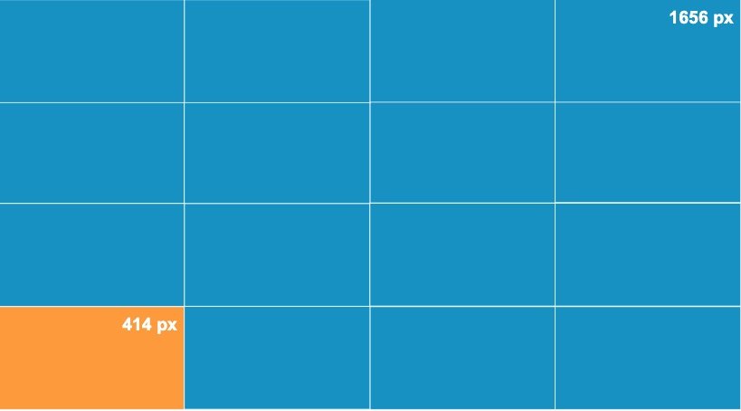
With pixel densities reaching 4X on a regular basis (and only increasing), you can see that getting this wrong only further exacerbates the issue of delivering wasted bytes. If pixel density is ignored, image sharpness and fidelity when viewed on an advanced display is diminished, resulting in a poor user experience.
By having a better understanding of screen resolution market share, the specific user bases' screen resolution breakdown, pixel densities, and other device characteristics, organizations are in a better position to deliver the right images at the right breakpoints, every time.