An effective breakpoint strategy helps deliver sharp, properly sized images, which are some of the most compelling pieces of content on a web page. Lack of such a strategy can lead to jagged images or ones that take too long to render due to excessive size, potentially reducing the overall effectiveness of web pages — and driving down the quality of the user experience.
Creation of derivative images at properly determined breakpoints is critical but often challenging for web developers and designers to achieve. Generating the right number of variants — and at the correct widths and spacings — for their users' critical devices can provide a great balance between byte savings and cache dilution.
While it's true that having too few breakpoints can improve offload, it can also deliver many unused bytes and place an unnecessarily high rendering burden on the device and browser. At the same time, when there are too many breakpoints, it may result in the opposite effect. Finding the right balance mandates some time and resource commitment, but the benefits are truly worth the exercise.
In this 2-part blog, we will explore just how significant image breakpoints are to businesses, and some important device-related factors to consider in image breakpoint decisions — from screen resolution market share and user base, to device characteristics to pixel density — to deliver the optimally-sized web image every time.
The Byte Loss Breakdown
Getting image breakpoints right is especially important at larger image widths. To illustrate, let's look at this example in which a web page is displaying two images that need to be resized by the browser 50 pixels in both height and width:
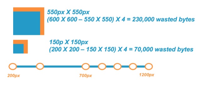
As you can see, delivering a 200 X 200 pixel (px) image for a 150 X 150 px use case (50 extra pixels in width and height) results in 70,000 wasted bytes required in memory for the browser to display the image than if the image were delivered at 150 X 150 px.
When looking at the larger image example, delivering a 600 X 600 px image instead of a 550 X 550 px use case (still 50 extra pixels in height and width) resulted in 230,000 wasted bytes, or 3.3-times more wasted bytes. This illustrates why it's recommended to have more breakpoints at larger image sizes (in this case, images larger than 700 px in width).
Another example to consider involves displaying images on a typical smartphone, in this case, the Samsung Galaxy S5. This model has a screen resolution of 1080 X 1920 px. Take, for example, a server sending an image of 1200 X 2000 px dimensions that must be resized to 1080 X 1920 px. This would result in more than 1,305,600 bytes — that's 1.3 MB — waste, not to mention a significant degradation in user experience.
Read Image Optimization Best Practices for Device Breakpoints - Part 2, covering 4 tips for getting image breakpoints right.