![]()
How do we organize log data in a meaningful way that will not only make sense, but also be practical, usable, visible, and accessible quickly; in addition to being organized to support DevOps and APM insights?
Despite numerous log data analysis deployments, we still identify many challenges users face regarding IT log data visualization, analysis, and insights. How can we make sure anomaly detection is fast and easy so that log management does not become too time-consuming? Here are some guidelines for building meaningful operational views and dashboards for IT, leveraging log search, log analysis, machine learning, and advanced analytics.
First Ask Questions
Although stating the obvious, before investing expensive efforts and resources into analyzing data, it is crucial to define your expectations and requirements. While in the past, merely collecting all log data and making it available for search was good enough, this is no longer the case.
In order to ask the right questions, determine what the most important use cases your log data has shown you and what role you want your log data to play in your future ongoing work. To do this, you must monitor system availability, software quality, continuous deployment, application performance, and business insights, troubleshoot, analyze security incidents, compliance audit etc.
There are specific use cases for the application life cycle. Architect, developer, tester, DevOps, APM, operations, and production support all have specific uses cases and requirements. Giving the right answer to the right question makes a big impact and will drive smart actions.
Then Visualize
Once the requirements and expectations are well defined, it is crucial to be able to visualize your findings for further analysis; the more detailed, the better. We recommend creating an App that contains a collection of dashboards. If possible, create a dashboard per topic or use case, and provide each one with a meaningful name (“performance”, “errors”, “user audit”).
Now create search queries, or use out of the box gadgets for analytics, to find example Apps that you will be able to use as examples of best use cases for log analysis data visualization.
How to Visualize
Once you’ve created search queries to analyze data and generate proper result sets, you will need to select the visualization gadget that best reads these result sets and visualizes it in the most effective way.
Here is a result set that aggregated and computed the avg. memory consumption and total memory usage of two application servers. Take a look at the figure below. On gadget 1 you can see the totals over 24 hr aggregated memory consumption at 1 hr intervals. This gadget tells the story of both servers. Gadgets 2 and 3 represent the same data but for each of the individual servers. Once we split the data for each server we discover that each of the servers had a very different memory consumption pattern.
An hourly aggregation for memory is far from being accurate; memory changes at a much faster rate. On the upper row of gadgets we see the totals for both servers (gadget 4), and two additional gadgets, 5 and 6, representing each server in 1 min intervals.
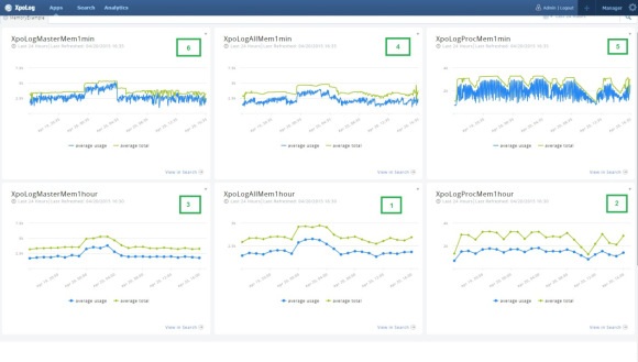
We were looking to monitor our application server memory consumption to avoid spikes that might crash one of our clusters. Choosing the right visualization tools, and in this case, intervals, makes a big difference.
Optimize Insights
Optimize your dashboards and visualization gadgets by verifying that they deliver the insights you’re after in the right resolution. In the example above, analyzing memory for the entire cluster did not provide a clear status image of the memory consumption, but grouping by server and later reducing the time interval resolution to minutes gave a clear understanding of which cluster spiked.
Actions
Once your Apps and Dashboards provide clear views and visualization, it becomes much easier to identify problems, trends, and insights on your IT and applications. Now you can monitor or view the dashboards live. Leverage the visibility and you will be able to take actions that will make your applications more agile, secure, and optimized for the business.
Ask More Questions
Go back to the first step. This is an ongoing process. Data changes every day. The content of logs and other data types is being updated by IT, developers, and vendors continuously. In order to stay ahead, keep asking questions and never stop looking for the answers.
Haim Koschitzky is CEO of XpoLog Ltd.